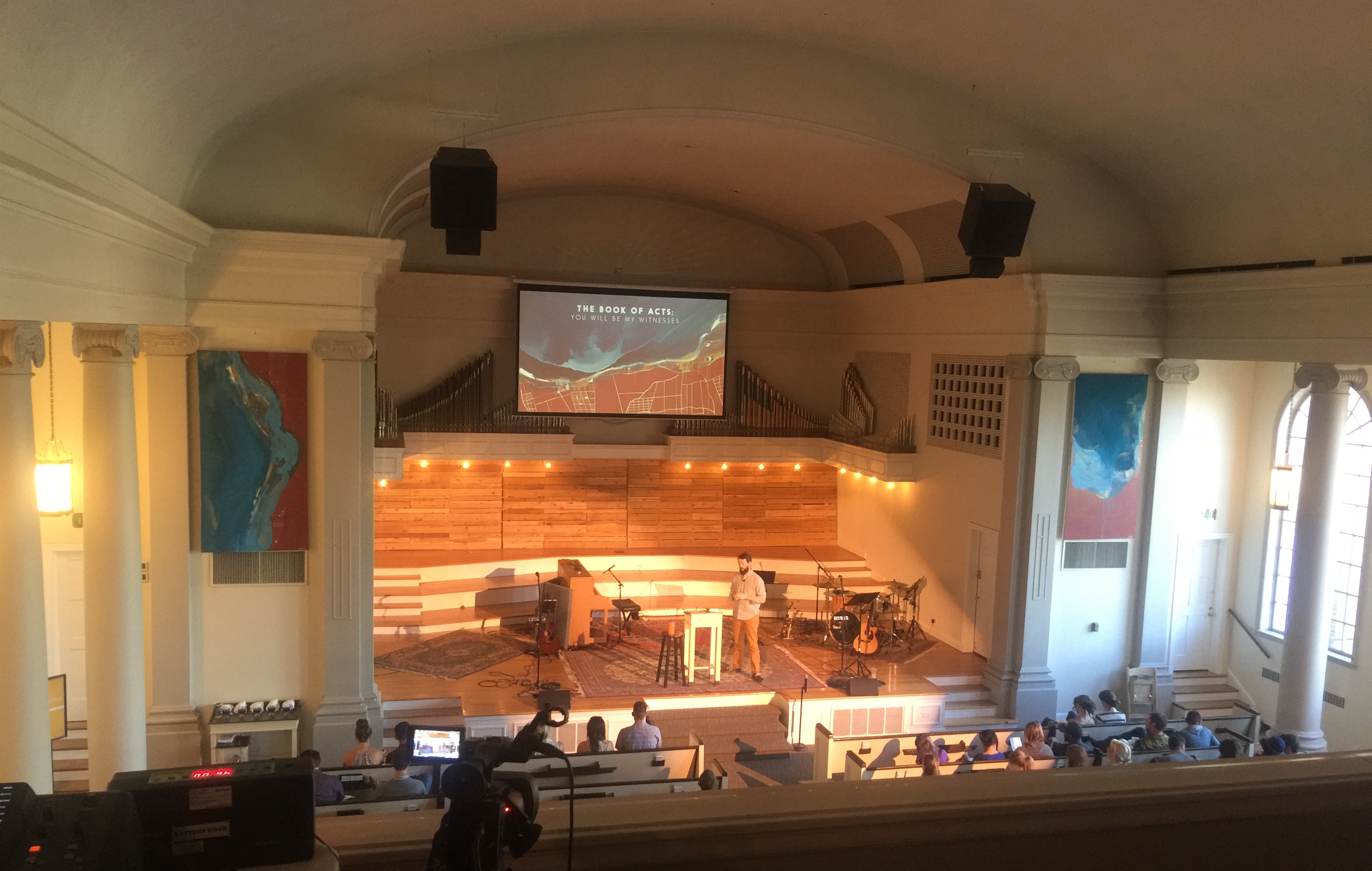
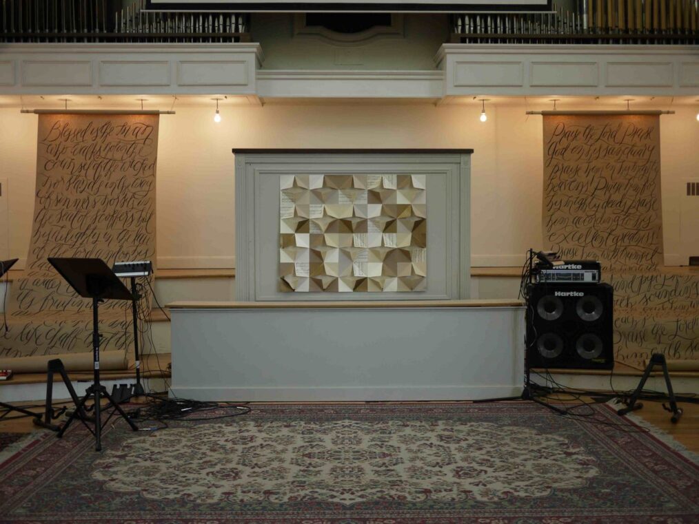
About the Artwork
You may have noticed the artwork for The Coming of the King: Advent & Christmas—the two banners on the sides of the stage and the design on your bulletin and on the screen during the service. If you were here last year, you may have already picked up on the fact that it’s all very similar to the artwork for God With Us, our Advent 2015 series. You’re correct.
Last year we worked with Jeremy Grant, an incredible designer and collage artist, to create that work. This year, we’ve taken Jeremy’s art from last year and, with his permission, “remixed” it for The Coming of the King. Why did we choose to do this? Here’s what Jeremy writes about the original piece:
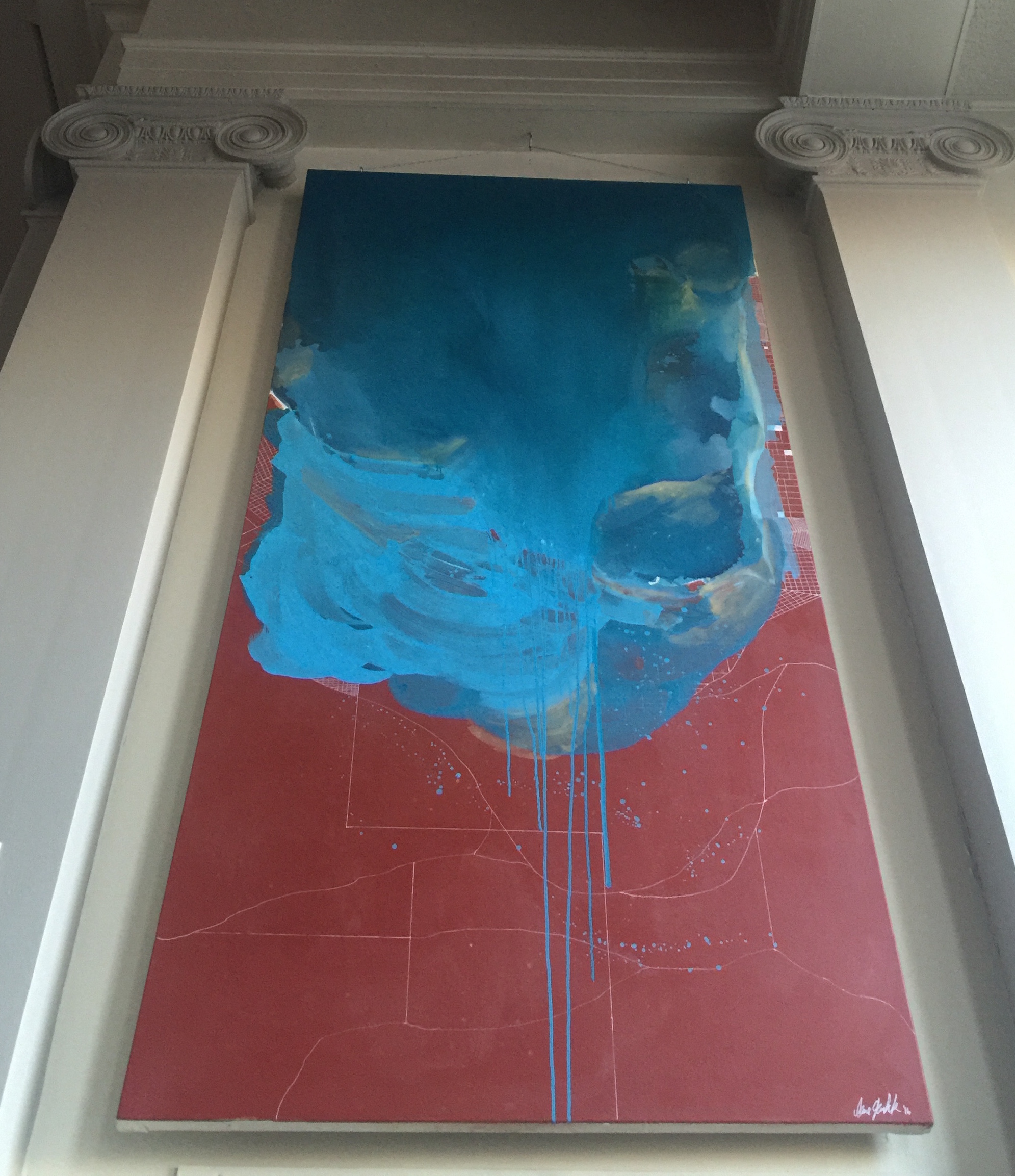
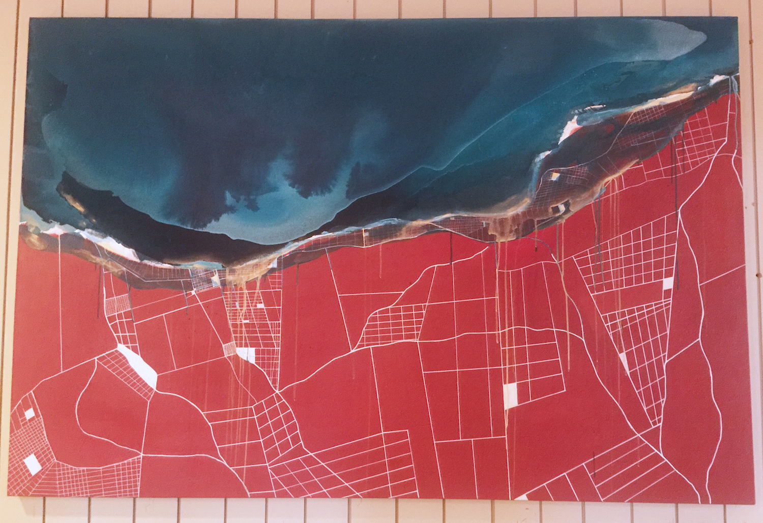
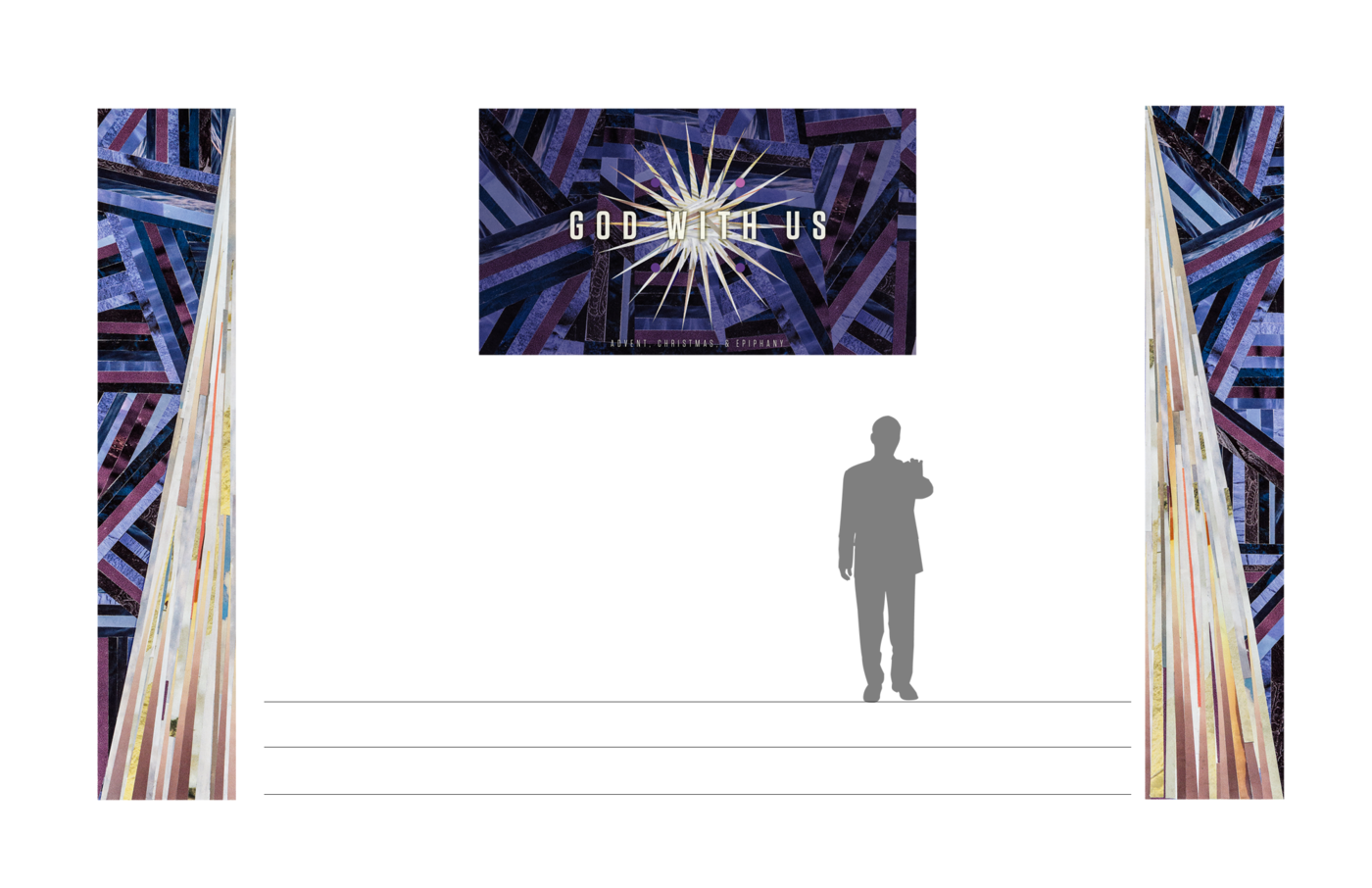
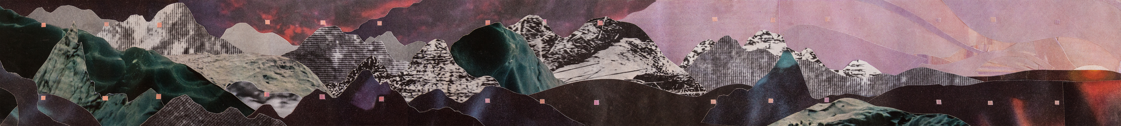
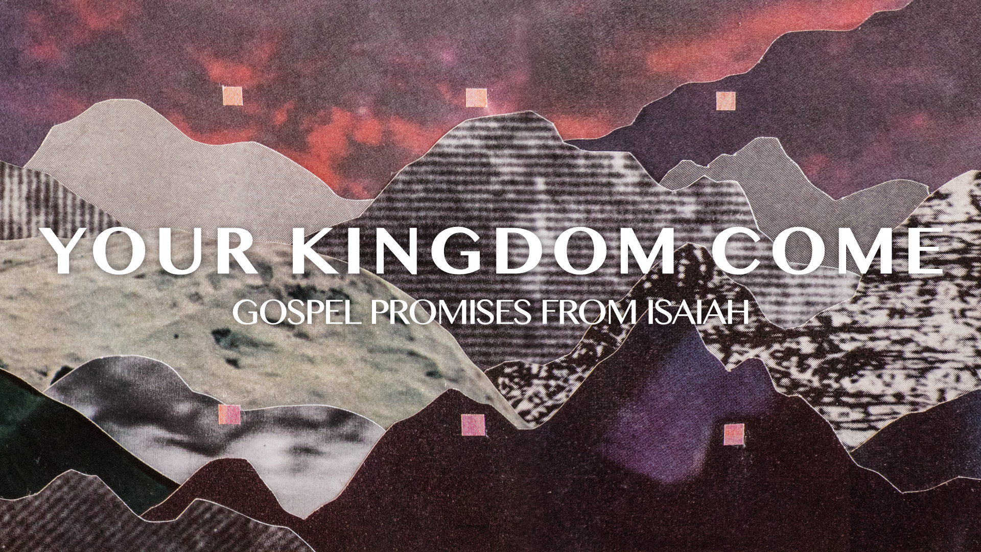
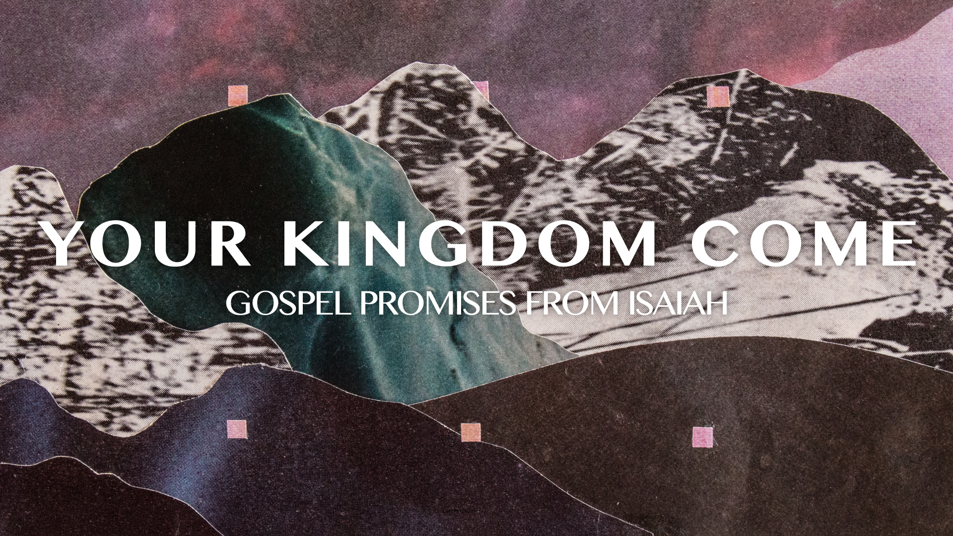
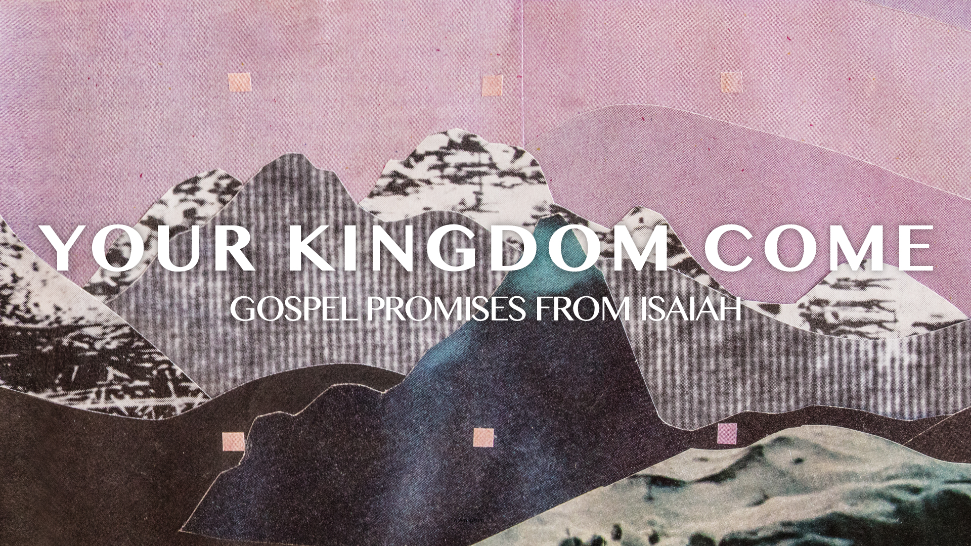
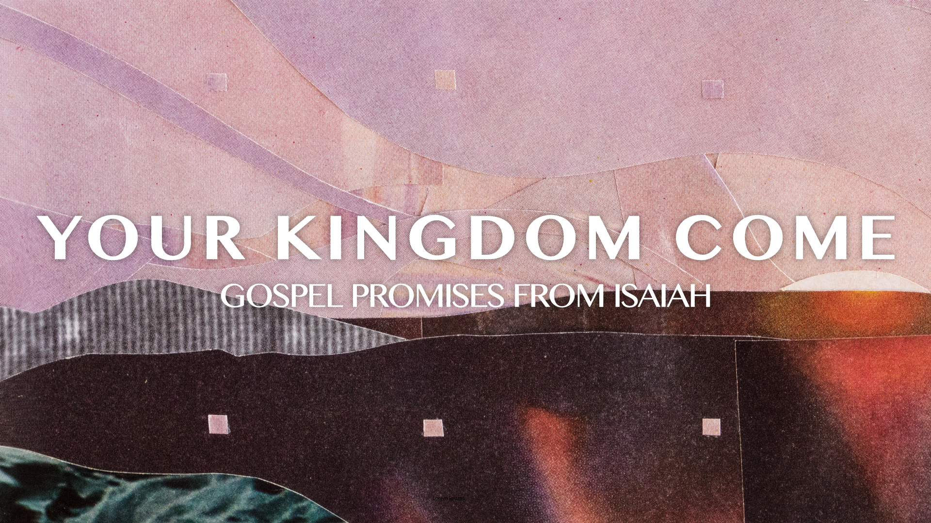
Purple and dark blue colors symbolize waiting and longing, and are the traditional colors of Advent. These darker areas (collaged from images of evening, twilight, deserts and water) show the brokenness and chaos of our world as they cut back and forth sharply.
Lighter colors (collaged from images of clouds and morning light) symbolize Jesus, the “light of the world,” cutting through darkness and chaos to bring light and peace. Little stabs of pink color represent joy.
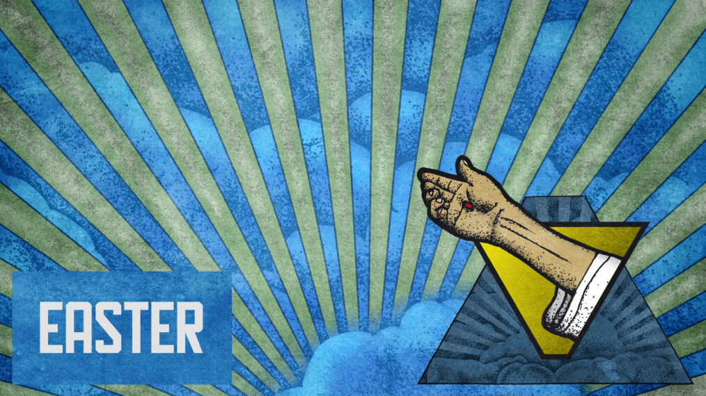
There are two banners, representing Jesus’ comings to earth. Jesus, the messiah, has already come down to earth (as a child in Bethlehem) fulfilling the longing of the prophets and people of God from centuries past. And Jesus, the master of the cosmos, has promised he will return to earth again. So we look back, and remember what he has done. And we look forward with eager anticipation to what he will do next.
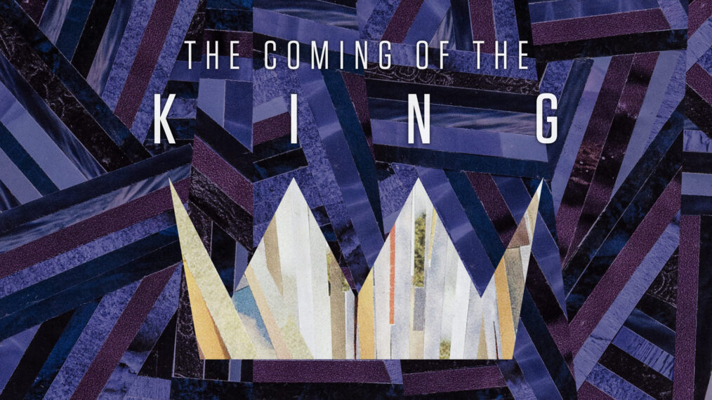
Whereas last year the lighter colors were in the shape of a sunburst, symbolizing the great shock and “thrill of hope” that is Christ actually among—God With Us—this year the lighter colors make a crown. Not too much of a stretch for a series entitled The Coming of the King, right? Why use something so obvious?
The lordship of Jesus Christ, although “obvious” to His followers, is certainly not obvious enough—not even to His followers! Do we understand that, in all of our darkness, in the valley of the shadow of death, in sin and error pining, a King has come and rescued us? Do we prepare Him room in our hearts to be the actual King? His crown is not symbolic, and His authority is over a real kingdom whose increase will never end.
Lastly, at the point of each crown is dot. Three of the four dots are purple and one is pink, symbolizing the advent candles that traditionally symbolize the four weeks of Advent leading up to Christmas Eve. In an Advent wreath, these four candles surround a larger, white “Christ candle” to be lit on Christmas Eve. In our illustration, the white crown stands in for the Christ candle, supporting those four other points.
About the Artist
Jeremy Grant is an award-winning artist and graphic designer. His collages and found-object assemblages have been exhibited in solo and juried shows across Colorado and Arkansas. Jeremy is married to an author, has two beautiful babies and loves Jesus, bourbon and robots. You can check out more of his work at jeremygrantcreative.com.


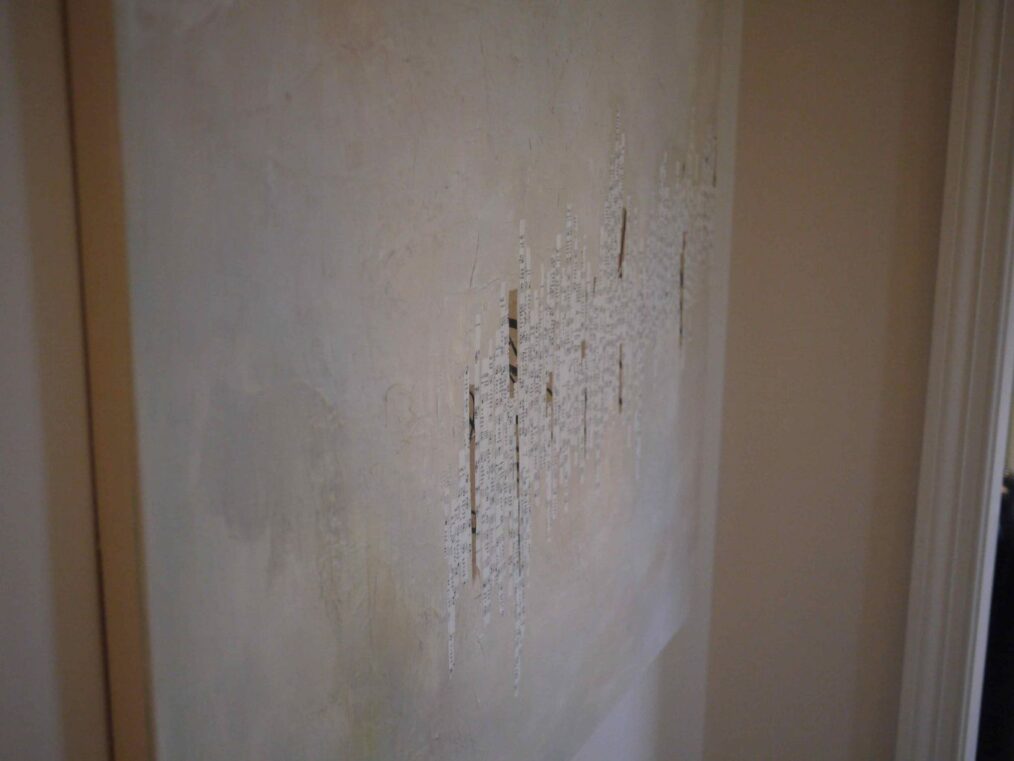
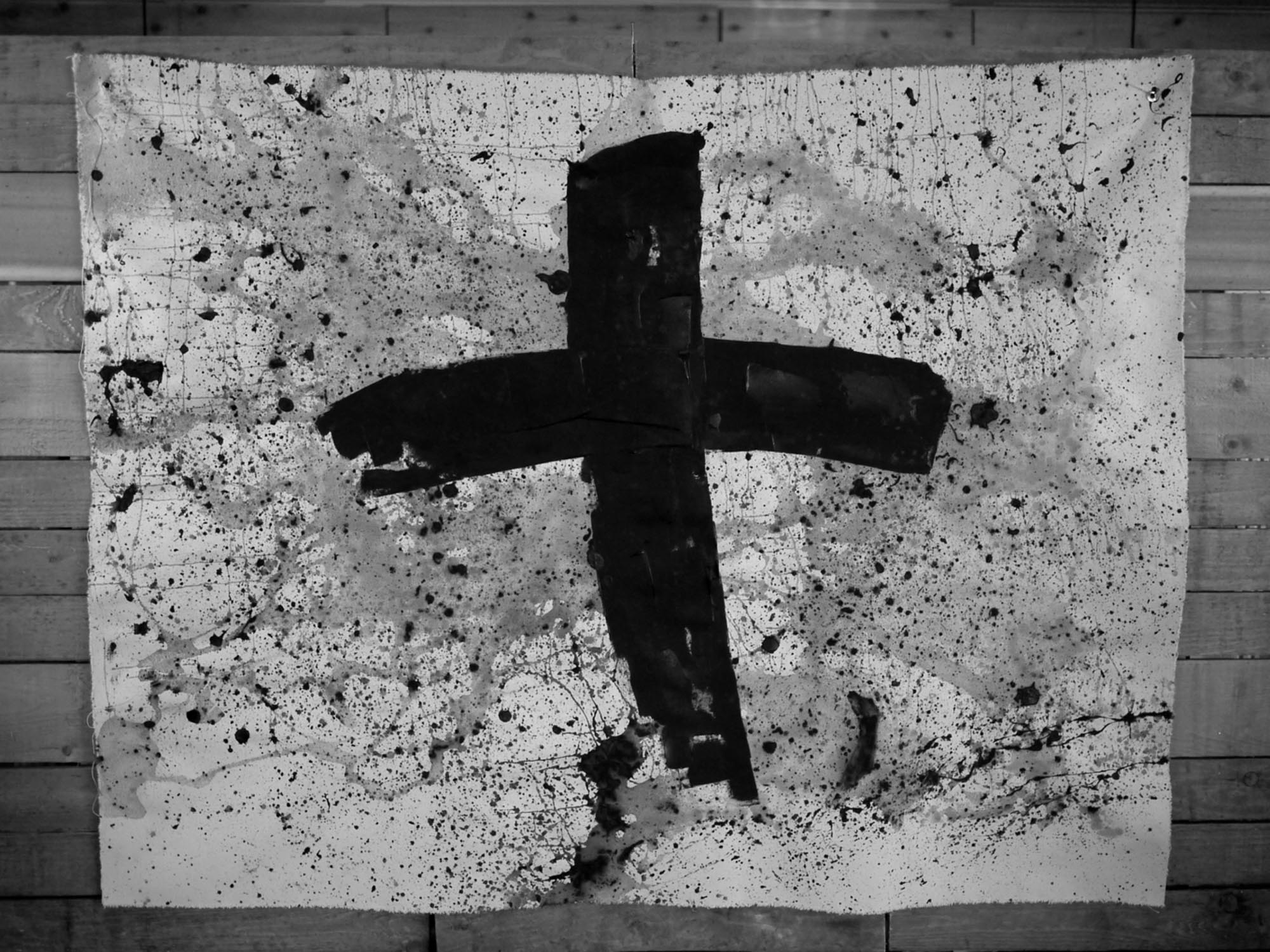
 In another early concept, I envisioned cracks and a shattered pattern getting less and less cracked -the color getting brighter and brighter as the collage progressed. U;timately, I felt like it was—again—less robust of an idea, and cracks don’t really “heal themselves.” It’s difficult to express that idea, even though I liked the graphic potential of it.
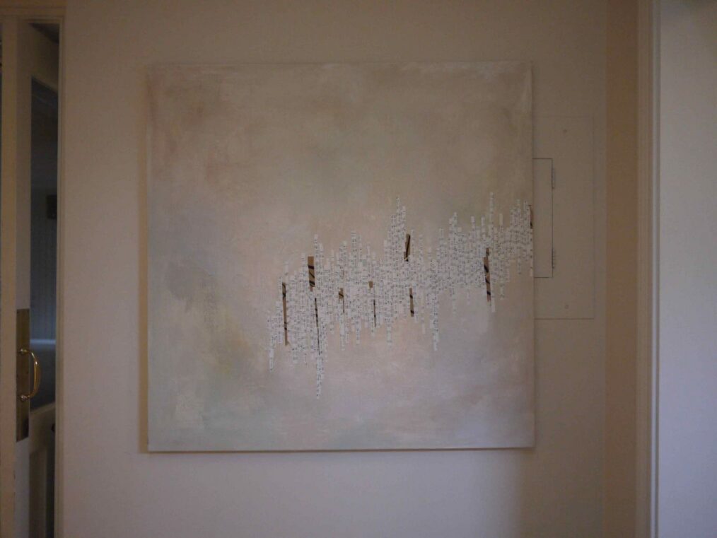
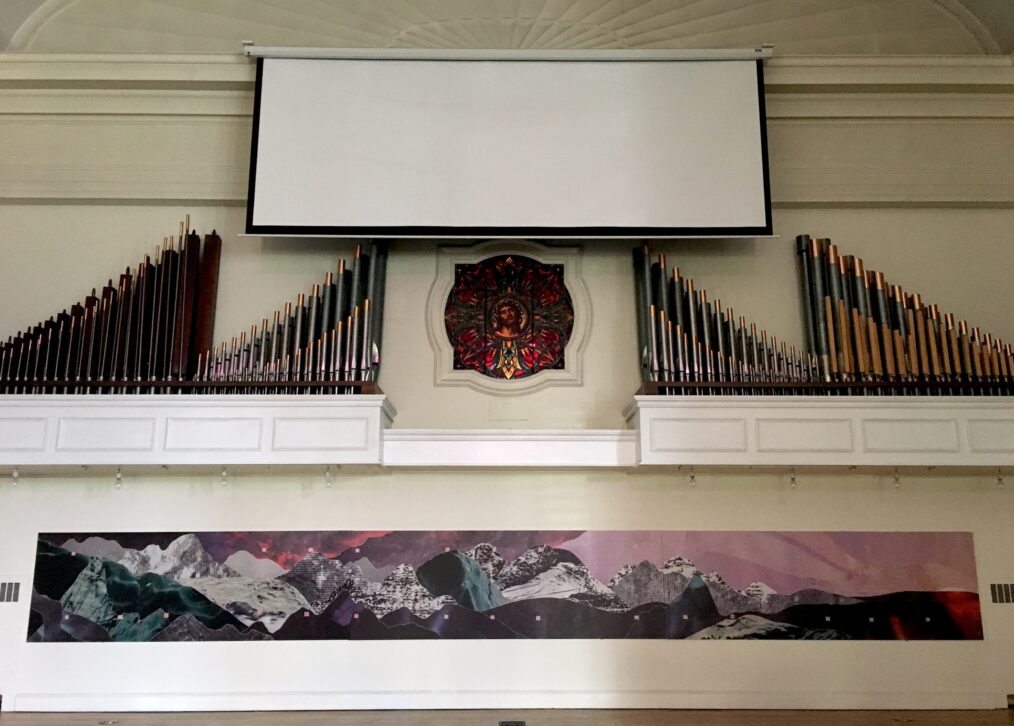
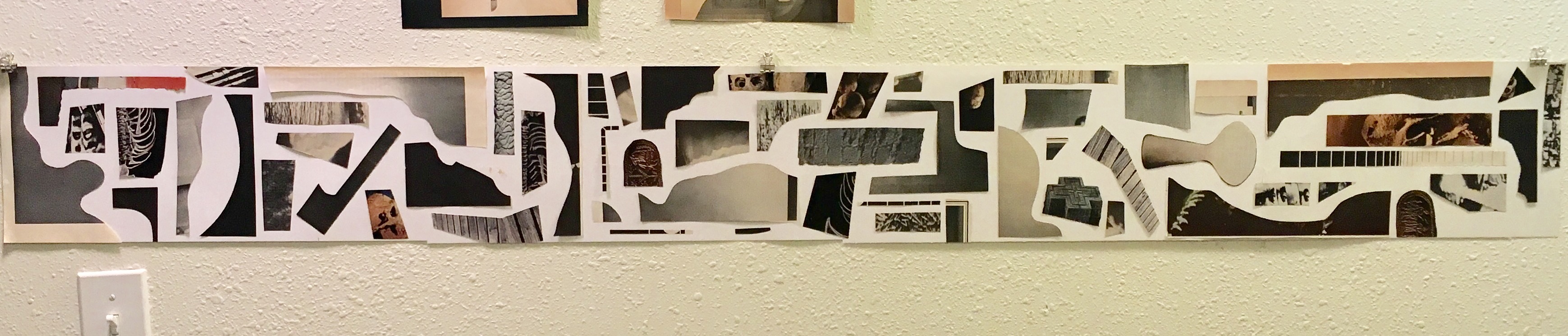
 Lastly, an image of the final collage in-process, before I added the pink squares. The squares sort of came to symbolize markers in the passage of time, little ebeneezers if you will.