Lent & Holy Week Artwork
At Park Church, we use visual artwork as an accompaniment to sermon series, church calendar seasons, church holidays, and some events. Besides the simple reality that good art is nice to look at, we also believe that—by engaging a different part of us than words do—artwork helps us learn.
Who is Avo Keerend?
Over the years, we’ve looked to different visual artists inside and outside of our church family to create our artwork. However, this year for Lent and Holy week, we’re looking several decades back in time to the work of an Estonian graphic artist named Avo Keerend. Keerend (1920–2012) was a trained painter and a prolific linoleum-cut artist, but turned towards making geometric-abstract pieces with letterpress and plastic printing (that is, by hand without a computer) near the end of his career in the 1980s. We’ve used five of these later, geometric-abstract pieces for this Lent and Holy Week collection. Learn more about Avo Keerend’s life here (your web browser will have to translate from Estonian!).
okay—Why does this matter?
We sing songs written before our time, enjoy a church building built before our time, and often reference authors who wrote before our time. Things like this remind us that we’re not the first or the last to live. Granted, for many in our community, these art pieces from the 1980s may not be “before your time!” Even still, to look back 40 years and be moved or challenged by an artistic work can teach us something.
Why these particular images?
In general, abstract geometry has always defied the world of art. Why should painting a circle be so hard? How can a mess of lines stir up so much emotion? How can complex narratives come to mind at the sight of simple shapes?
For a brief answer to these questions, let’s look to a few more-complex art forms. An elaborate oil painting, a hand-woven tapestry, or the sound of a full orchestra are each the work of a thousand soft touches. These types of art can wow us with their wonderful abundance of detail and nuance by giving our senses a lot of “information.” One might say this information comes with a decision to either sort it all out (“What am I seeing? What am I hearing? How is this possible?”), or to simply let it “wash over you” (“What am I feeling?”). How wonderful to choose either!
On the other hand, abstract geometry is wildly different. Compared to an oil painting, a handful of squares or lines pressed onto a canvas (with a just little shading) might take 100,000 less touches. The finished piece gives our senses so much less “information.” To some, this may lead to questions that sounds less like “What am I seeing? What am I feeling?”, and more like “Is this even art?” This is a common and valid opinion! Other viewers may feel significantly moved, even challenged to interpret what they’re seeing.
One Interpretation
As a fan of this artist and this style of artwork, I (JD Raab) wanted to provide one possible “reading” of each panel in this series. But before I begin, it’s important to note that these art pieces from Avo Keerend were not made for the application to which I’ve set them—I have enjoyed interpreting them and applying them as such. This is one of the beautiful strengths of this sort of artwork—it can mean many different things. Let me tell you what I see…
Ash Wednesday
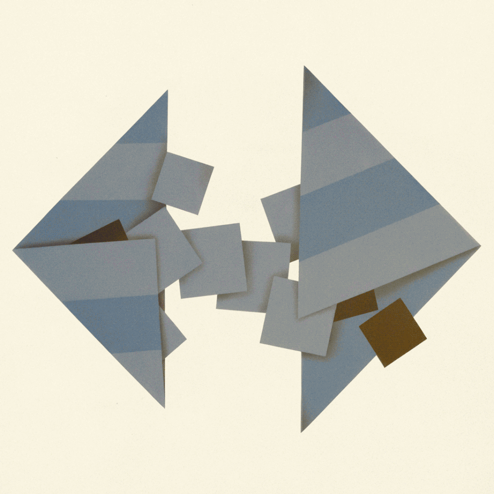
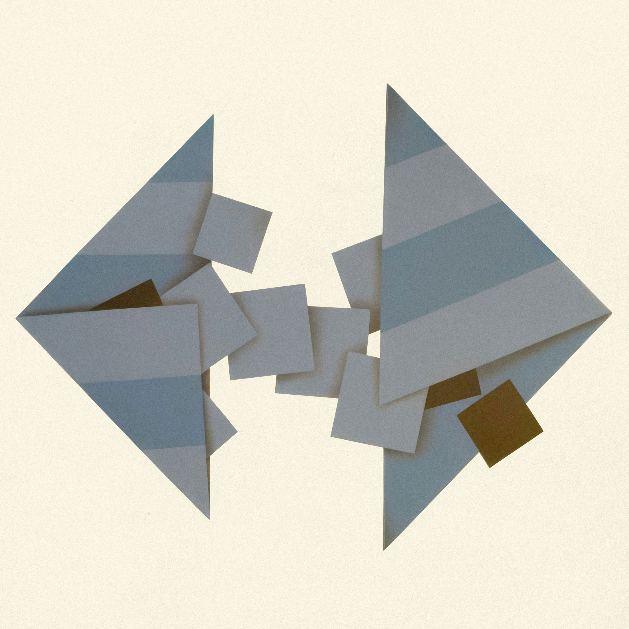 The squares feel as if they move from left to right and create a narrative. Perhaps only one square moves, but we see it pictured in a few “stages” of its journey? The dark square at the beginning (hidden in the fold of the large left triangle) and the dark square at the end (falling out of the larger right triangle) work as bookmarks in a journey: a start and an end. In particular, we may see a movement reminiscent of Genesis 3:19—from dust to dust; a falling like gravity.
Lent
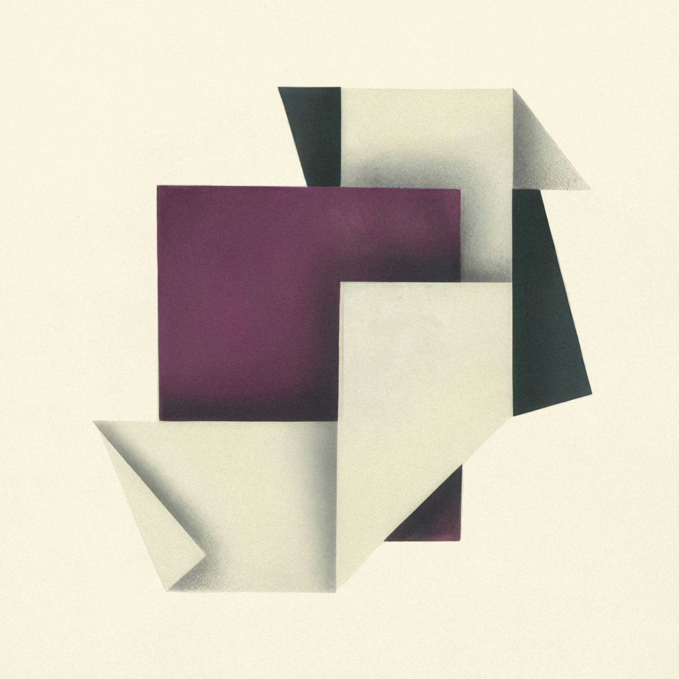 Though the shapes furthest back in this composition are dark (perhaps representing original “dust,” as referenced in the Ash Wednesday piece), there is a lighter foreground, appearing as a sort of sash over the purple rectangle (Lent is traditionally represented with the color purple). Taken altogether, this purple rectangle can illustrate the tension we feel in this season: mortality and sin is right behind us, but in Christ we are truly wrapped in His righteousness and life. Furthermore, in the image, the black shape is separated from the purple rectangle by this white sash—just as we are ultimately separated from our sin and death. The question of “how is any of that possible?” is appropriately felt!
Palm Sunday
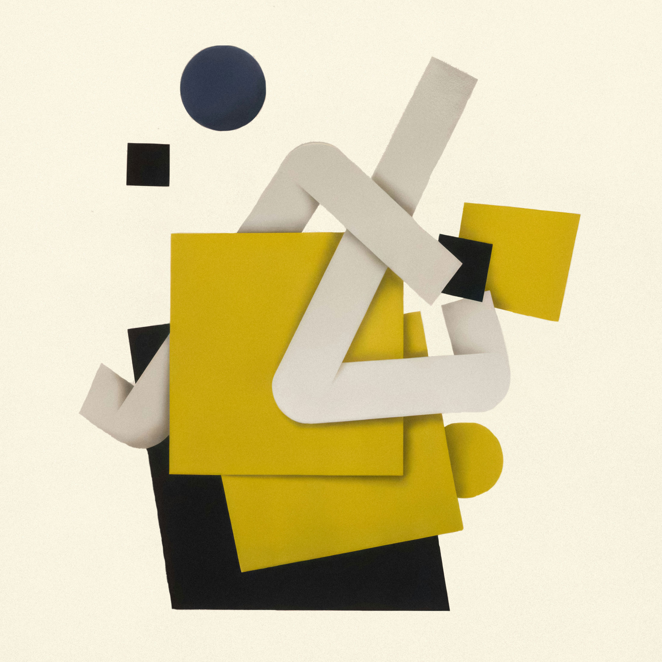 Bright yellow shouts of happiness are present, but as in the previous piece for Lent, dark shapes are furthest back in our image. The irony of Palm Sunday is clear—those who know the whole story can rejoice with a “Hosanna!” while knowing that “Crucify Him!” can come from the same place. We say with David “Unite my heart to fear Your name!” (Psalm 86:11). This art piece also shows a white shape entwined above, between, and below the other shapes. As in our piece for Lent, I see this white “path” representing the presence and foreknowledge of Christ in all of the happenings of Holy Week (and how it plays out in our hearts today).
GOOD FRIDAY
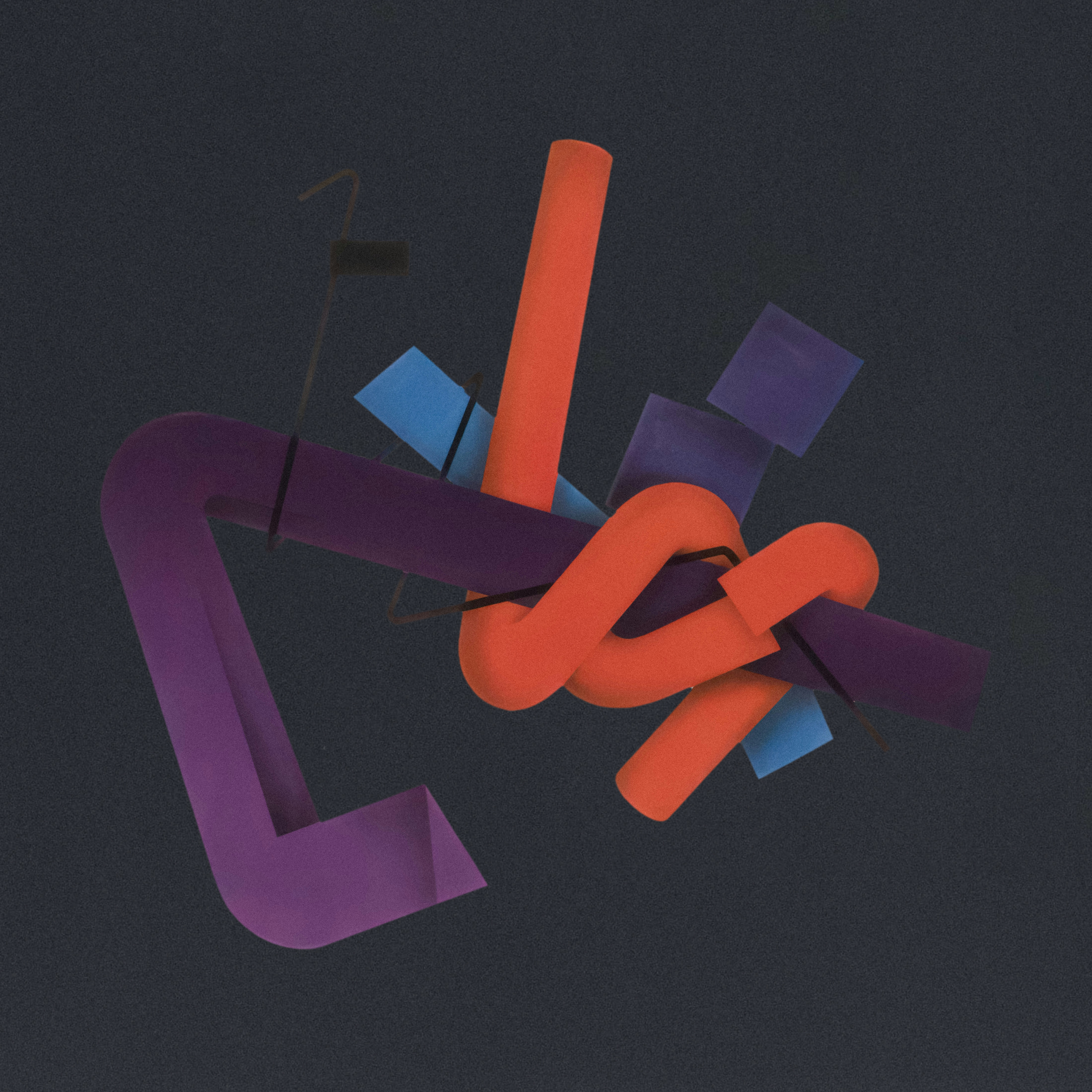 As we get to this piece, all instances of light and warmth are gone. The black present in the other pieces is now the entire background. The white shape and/or path from the previous pieces has turned purple, and is wrapped in red and black serpentine forms. The white turned purple illustrates the royalty of Christ in His death (his upside-down throne). The red and back illustrate the hatred, the sin, and curses that fell on Him in this moment. It’s an entangling, suffocating mess, but the shape representing Jesus is shown as larger as the other shapes, extending well past them and even turning to “see” them. His sovereignty is unaffected.
EASTER
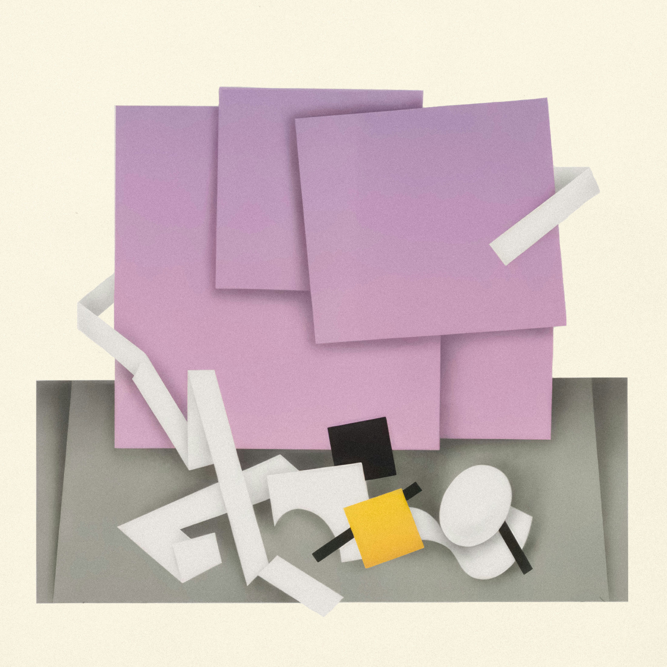 As you view this piece, I challenge you to picture it as “zoomed out” in comparison to the other pieces. Imagine that its scope has to be much larger! Shapes of yellow and black that previously seemed central are now laying small against a massive, layered backdrop that’s bright with the shades of a dawn sky. The white from earlier pieces now wraps around the sky and amongst the shapes on the ground, even supporting the yellow and black shapes. It’s as if the whole “stage” is now visible, and the end is clear.

